
 HOME
HOME


The hockey stick fiasco
Part 1: The hockey stick and real life
In 1998, the journal, Nature, published a paper by three scientists which purported to show that global temperatures had been reasonably constant for a millennium up to the early twentieth century and then they had risen very rapidly, particularly at the end of the century. And they published a graph covering that thousand years. Because of its shape, it became known as the ‘hockey stick graph’.[1]
This was an important development and it is used to reinforce the claim that the amount of carbon dioxide (CO2) in the atmosphere, issuing from vehicle exhausts and heavy industry was the cause of an unprecedented hike in global temperatures.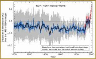
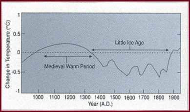
Until the UNs 2001 report, the existence of a warm period of about 500 years between c.950 and c.1450 AD had not been controversial. The mediaeval warm period formed part of a natural cycle of climatic variations that had been apparent since the end of the last Ice Age around 12,000 years ago.
When Mann et al's hockey stick graph was published The IPCC then replaced that earlier, quite different graph (shown below) with the new one. Because of the dramatic rise in CO2 and temperature it purported to show at the end of the twentieth century, it was the most powerful weapon in the IPCC’s armoury in its case for man-made global warming.
But we know that the graph (known by the initials of the three scientists and the year of publication as MBH98) does not give a true picture of temperatures over that time.
How do we know? Well, we have well documented accounts.
The mediaeval warm period
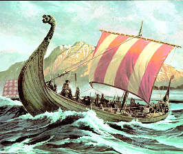
When Erik Thorvaldsson Raudi, aka Eric the Red,
continued his westward voyage from Iceland in 986 AD,
he came to a land so lush and verdant, that he named it
for its colour: Greenland. Eric didn’t call it
that because it was covered in ice and snow.
The
Danes colonised Greenland and farmed there for some 400
years. That was during a period known now as the
mediaeval warm period. It was a time when temperatures
in the northern hemisphere were significantly warmer
than they are today.
This warm period is not
acknowledged in the hockey stick graph, but there is no doubt it happened.
The Little Ice Age
But that pleasant climate wasn’t to last; a subsequent climatic decline, during which the arctic pack ice advanced southward in the North Atlantic, was abrupt from about 1300 AD. It culminated in the ‘Little Ice Age’, which was actually a series of three distinct cool periods. It started with The Wolf Minimum about 1300 AD. After a slight warming around 1400AD, there was another cool period, The Spörer Minimum, from about 1450 to 1550, and this was followed by the Maunder Minimum from about 1650 to 1840.
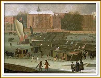
During the Little Ice Age the Thames froze in winter and Londoners not only skated on it, they held markets and fairs on it.
We are now just recovering from the Little Ice Age – and the world is still well below the temperatures of Eric’s time.
There is an analogy I like to use: If you are standing in the middle of a flat plain at a point where your map says there is a mountain, it is your map that is wrong, not the earth. In similar fashion, despite the temperatures in MBH98 being relatively flat for a millennium, we know that they were anything but.
References
1. Michael E. Mann, Raymond S. Bradley and Malcolm K. Hughes. Global-scale temperature patterns and climate forcing over the past six centuries. Nature 1998; 392: 779–787.
Part 1: The hockey stick and real life | Part 2: An artefact of poor mathematics
Last updated 8 March
2009
Related Articles
